Redesigning Dublin Guide
Background
I chose to research the problem of high bounce rates and other poor KPIs on DublinGuide.ie as my UX project for Interaction Design Class at TU Dublin.
Dublinguide.ie is a guide to Dublin’s events, famous places, and visitor attractions. The website’s unique twist is the ability to see all events by location. The developers made the website’s UI using a pre-designed template. In addition, they didn’t plan the information architecture and created categories “as they go”.
Problem Statement
Although the traffic to Dublinguide.ie is growing and now reaches nearly 7,000 unique visitors per month, the bounce rate is very high at 84%, meaning that most visitors come to one page and bounce right out of it. I wanted to analyse the website and find out why and how I could improve its usability as well as the aesthetics of the site.
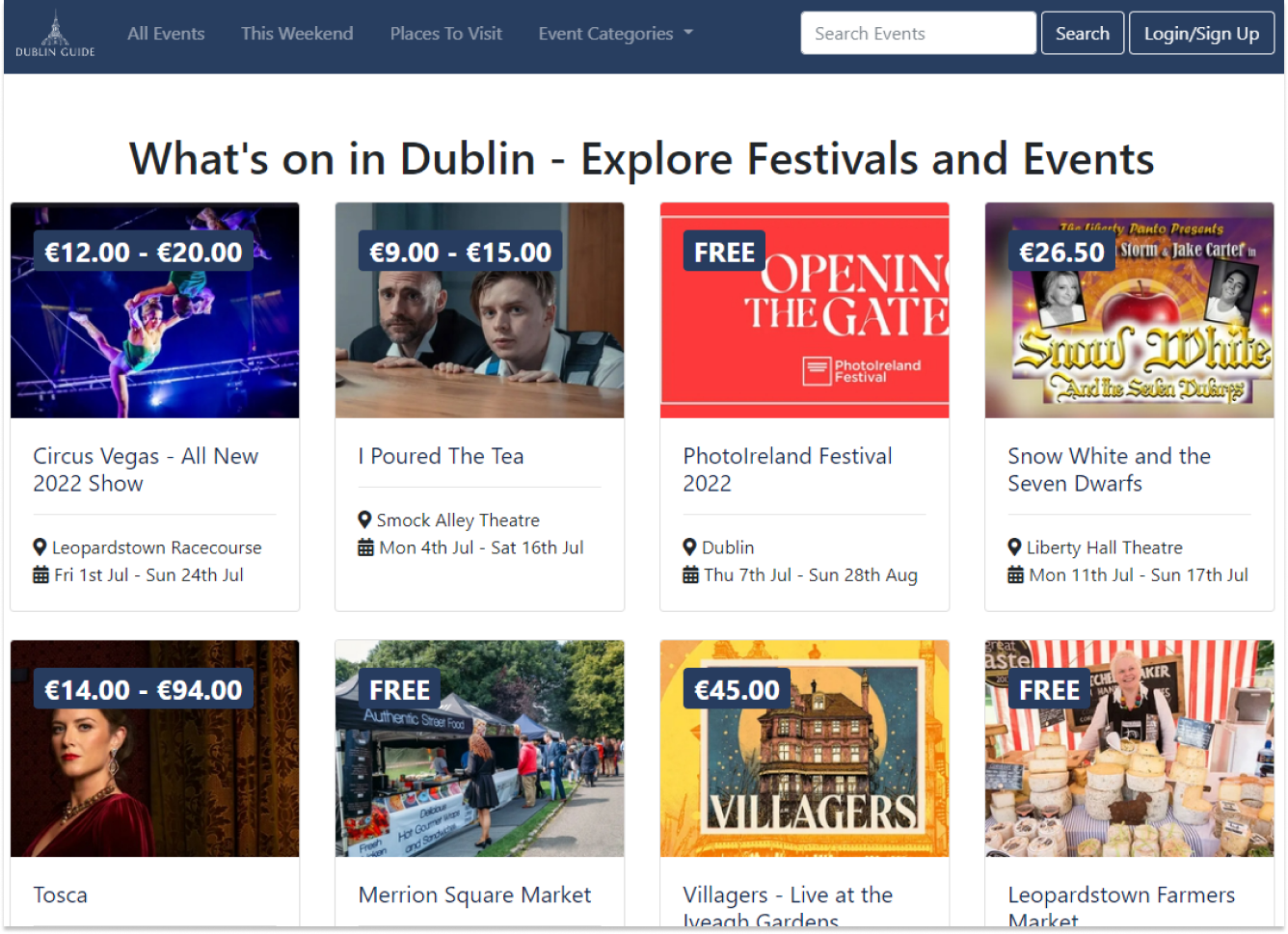
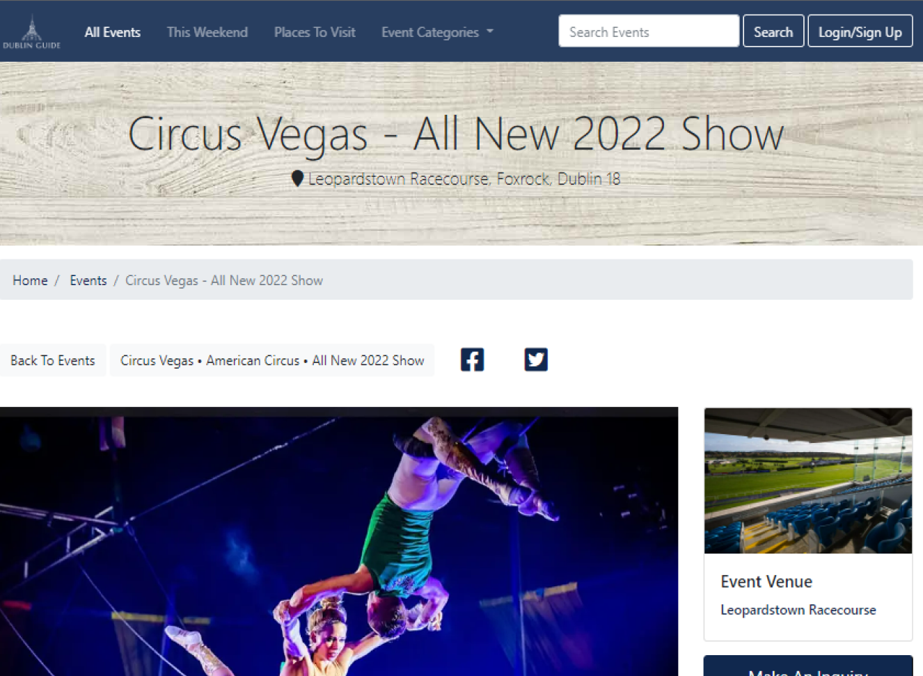
Dublinguide.ie before redesign:
The Challenge: KPIs to Improve
How can I improve the website’s usability to improve the key performance indicators of the website (KPIs):
Hypothesis for High Bounce Rate
I hypothesised that there are several reasons why people bounce right out of the pages:
The “Why”
People tend to get to their favourite locations, parks and squares, but they don’t know what events there are as most event websites do not list events by the site. In addition, most event websites focus on paid events, and there is very little information about free events. Also, most “guide” websites are focused on tourism. Therefore, they lack basic information, for example, “where to scrap Christmas trees in Dublin” or “summer camps in Dublin”.
Dublinguide.ie before redesign:
Business Opportunity
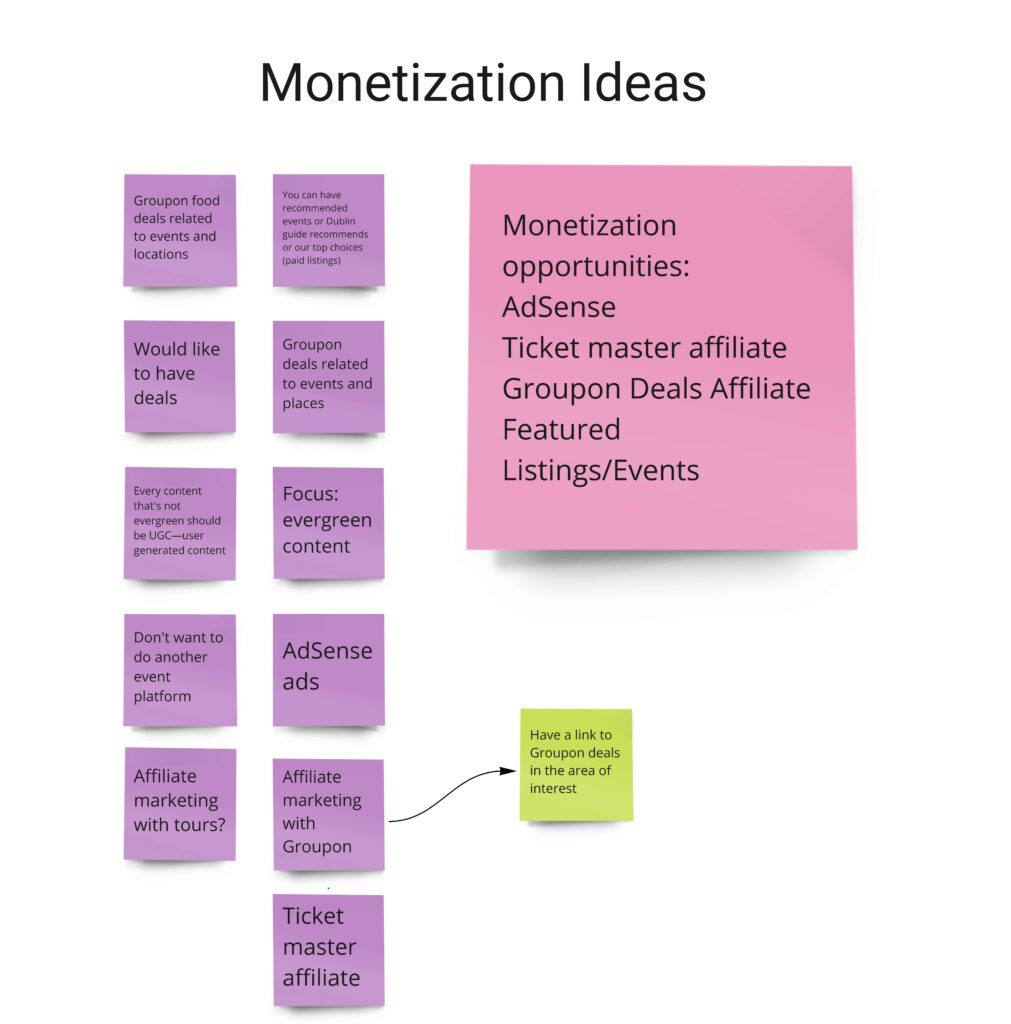
This website would be an excellent way to reach regular people living in Dublin. An email marketing opportunity on the website would give access to people interested in events and happenings in specific locations, providing a more targeted audience for advertisers. In addition, the website could start selling tickets and Dublin tours for tourists and locals in the future.
DISCOVER (RESEARCH)
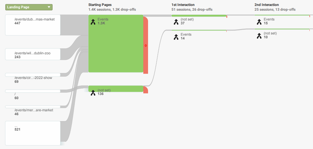
Behavioural Flow Analysis – Google Analytics
Behavioural flow analysis on Google Analytics confirms the hypothesis that most people end up on the specific event page and don’t go much further and bounce off. Most of the remaining people click on “events” but don’t go anywhere further and bounce right out of that page, suggesting that the website’s structure is somewhat flawed.
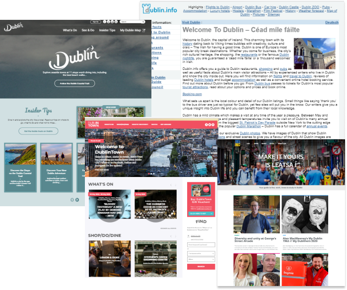
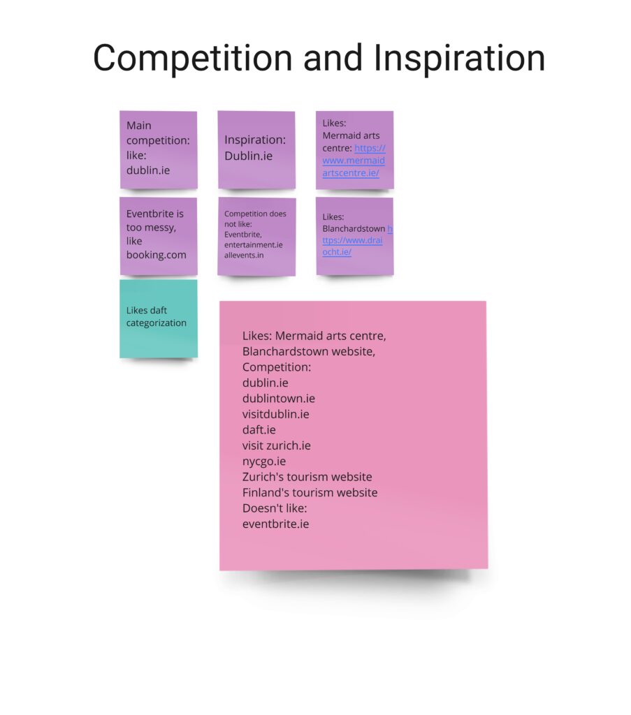
Competitor Analysis
First, I conducted a competitor analysis to see where Dublinguide.ie stands among the competition. I looked at the following four websites:
Main findings from the competitors’ analysis:
1. All these websites focus on tourists and people moving to Dublin to live.
2. However, there is very little information for locals. Also, the websites that advertise events do not show events by location.
Stakeholder Interview
I ran a stakeholder interview with one of the developers. I wanted to understand their strategic goals for the website. I asked the following:
Main findings from the stakeholder analysis:
1. We should aim the website at local Dubliners more than tourists;
2. In the future, the website should be like a hub for all questions related to living in Dublin;
3. The feel of the website should be cosy, warm, friendly and inviting. We should aim the website at local Dubliners more than tourists;
4. In the future, the website should be like a hub for all questions related to living in Dublin;
6. The feel of the website should be cosy, warm, friendly and inviting.
User research
1. Semi-structured user interviews
Interview Questions
As part of user research, I ran two user interview sessions followed by usability tests with potential DublinGuide.ie Users. I wanted to check the following:
Key findings:
2. Usability Test
For the usability test, I asked them to look around Dublinguide.ie website. Then, I asked them to describe the website in their own words and explain what they think the website offers. I finally gave them two tasks to accomplish on the website and observed them while they were doing the tasks. This research resulted in a list of pain points, missing features and good-to-have ideas.
Key findings:
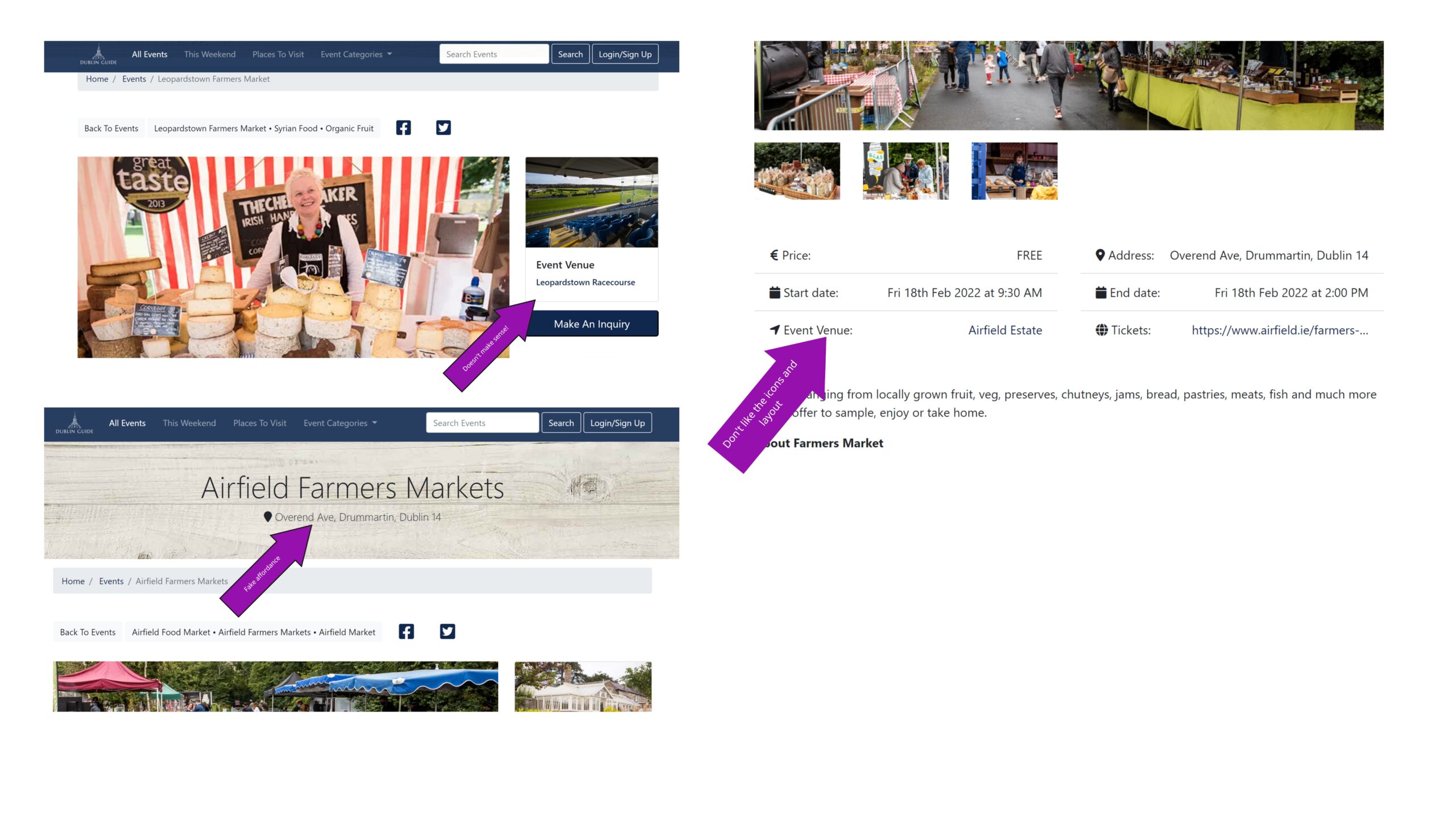
I uncovered a lot of essential data, missing features, needs for improvement, and some serious usability issues and pain points. The main being:
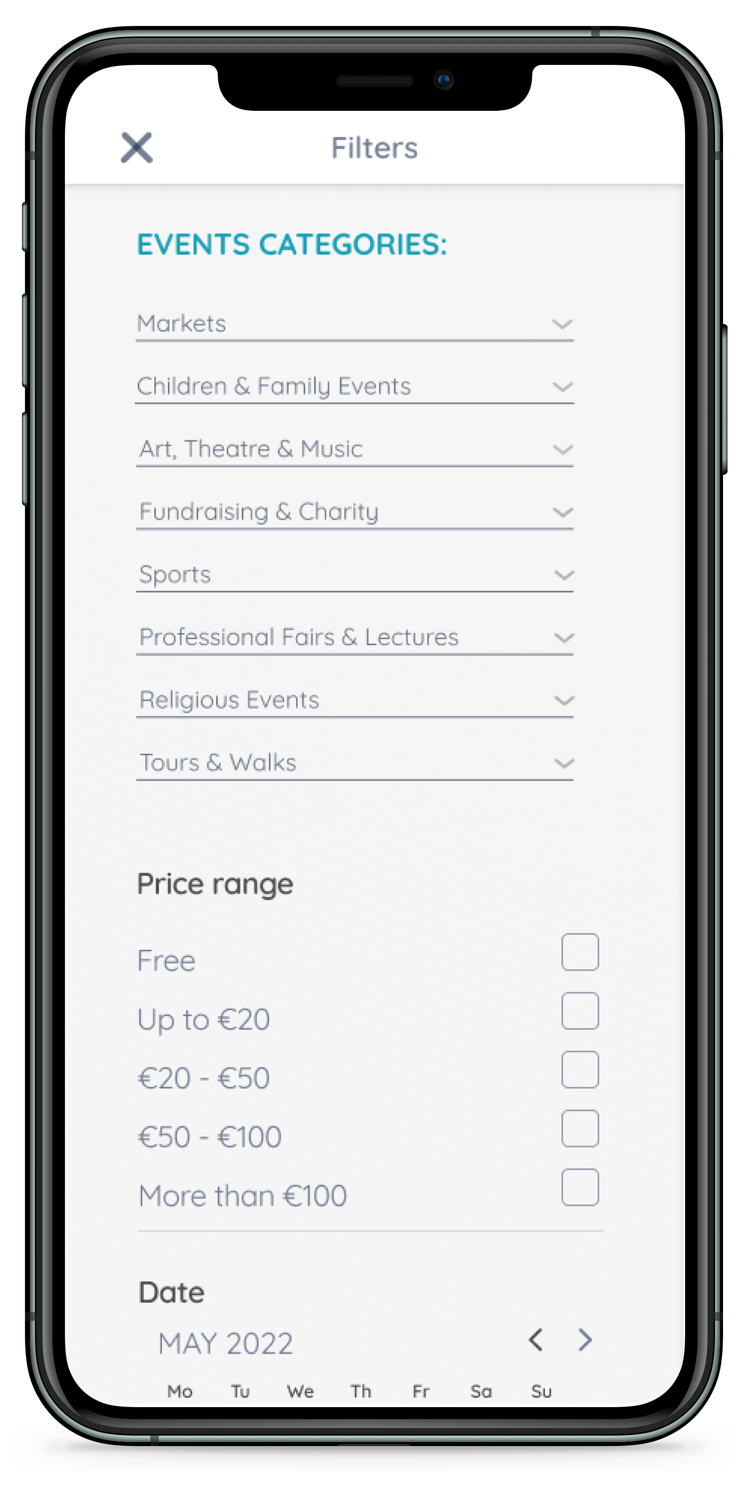
1. There is no “filter by date” feature. Therefore, Users are trying to put the date into the search field.
2. There is no “save the event” or “add to favourites” on the events page; therefore, users write the event details on the notepad.
3. The navigation is confusing, and users don’t know what to click; rather than using navigation, try to use “search.”
4. The website has many Usability Heuristics issues, such as unrecognizable locations, fake affordances, and a lack of consistency and efficiency in user flows.
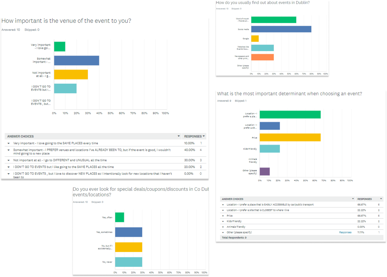
3. User survey
I surveyed ten people to figure out if my hypothesis was correct:
Key findings:
67%
Think the venue is “important” or “very important”. Therefore, users prefer going to places they have already visited; Therefore, the data suggest the hypothesis about the venue is correct. So, the location could be the driver of the events
70%
Do not subscribe to newsletters or subscribe but never open them.
Therefore the newsletter feature is not essential to DublinGuide.
80%
Find out about events on social media or word of mouth; Therefore, social presence would be significant to Dublin Guide.
DEFINE (SYNTHESIS)
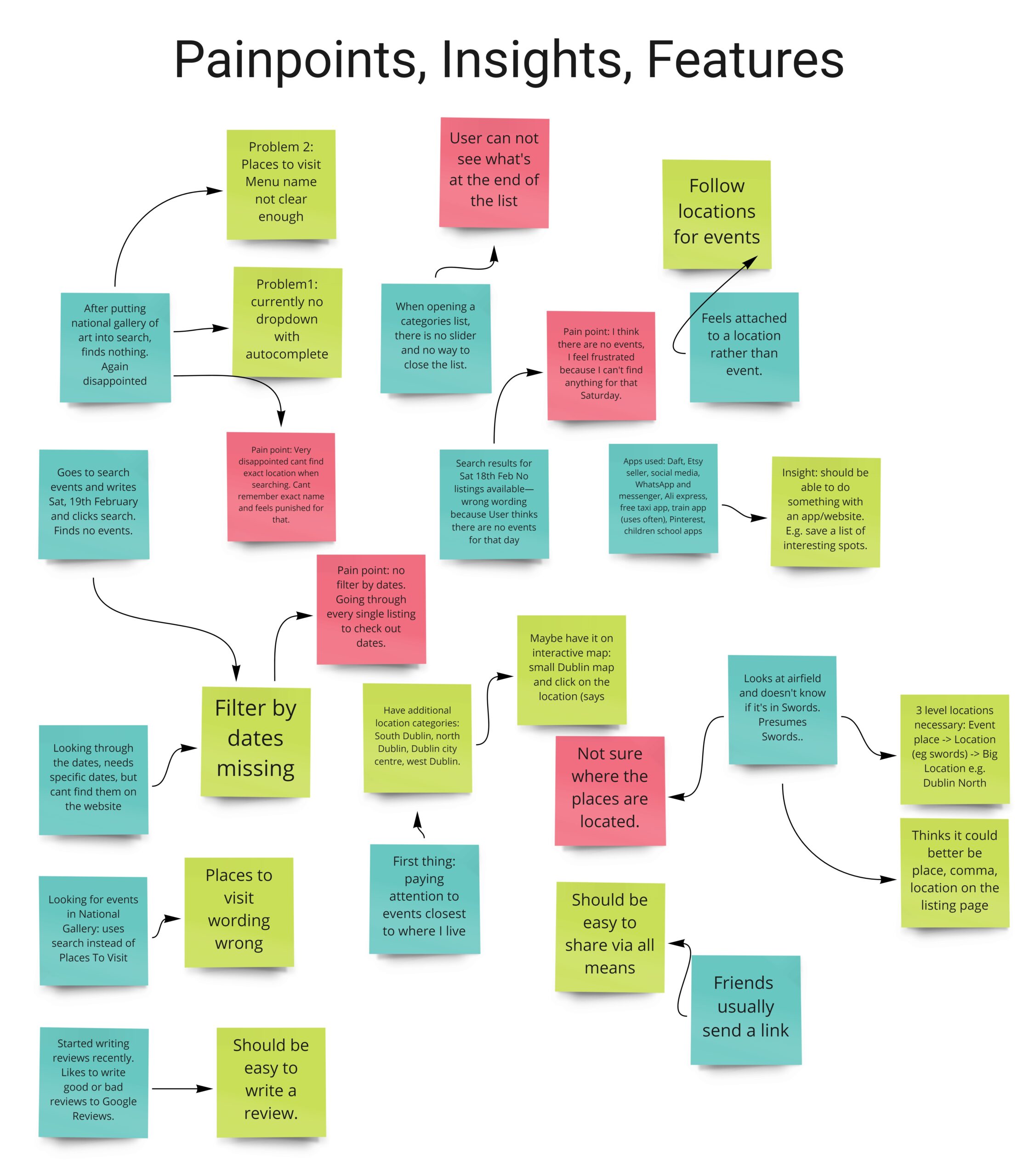
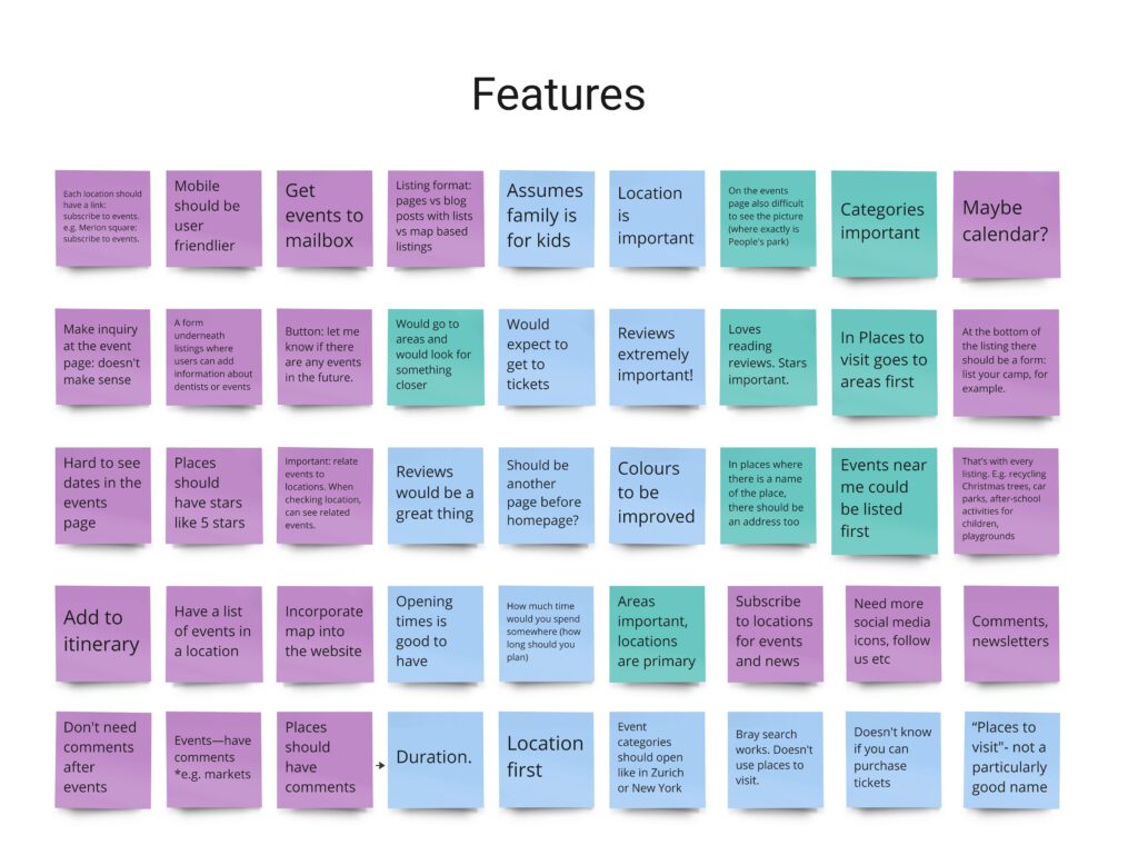
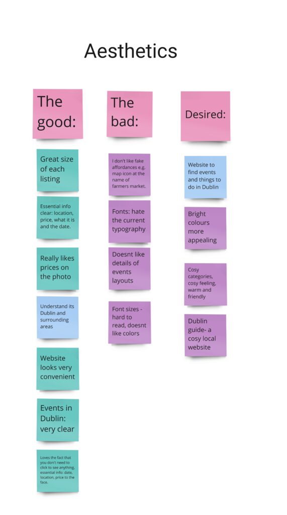
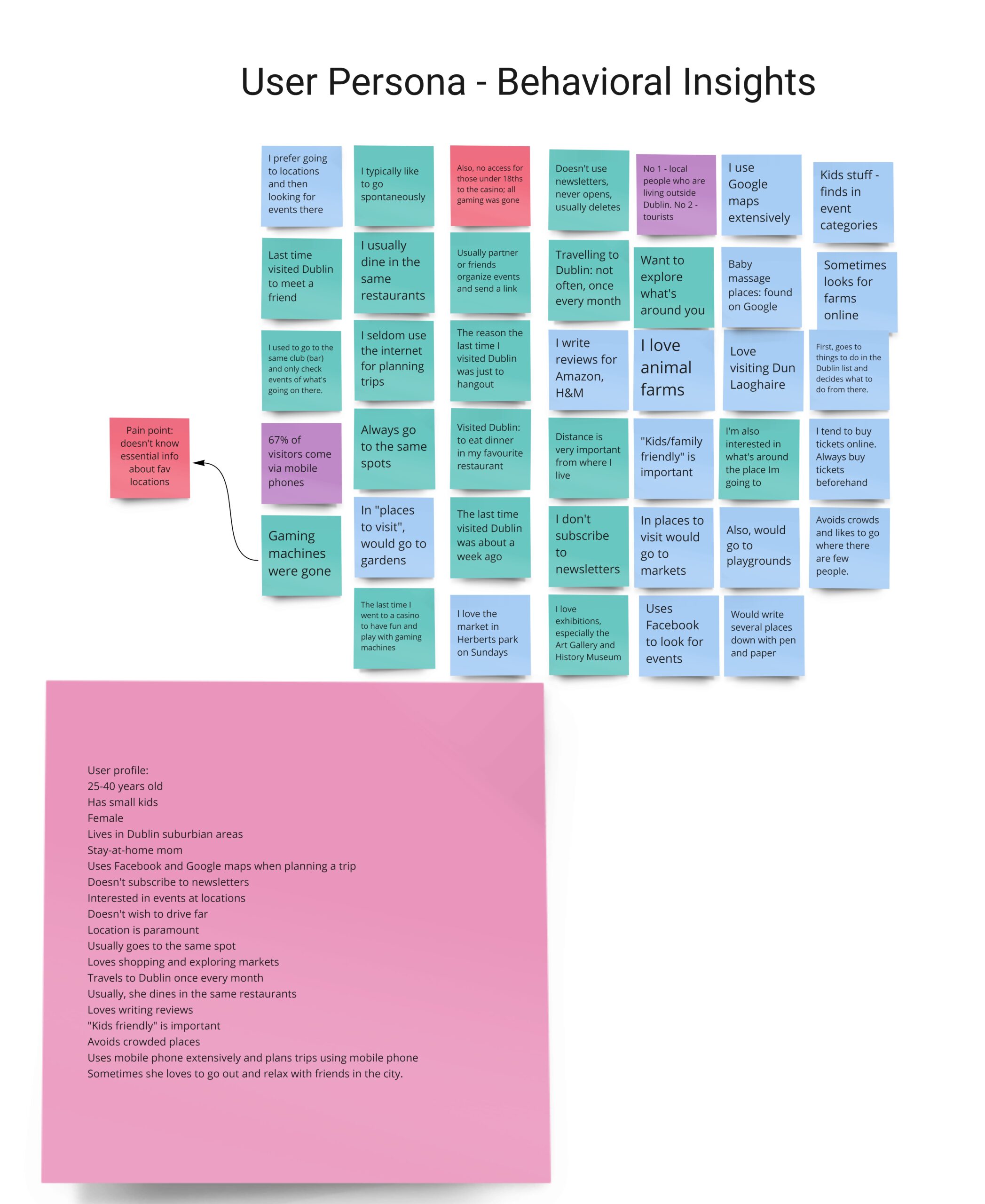
Affinity diagram
I started the “Define” phase of the UX Process by synthesizing user research findings in Affinity Diagram. First, I reviewed User tests and noted the meaningful insights on post-it notes. Then I categorized the messages into distinctive categories. Different colours mean different respondents (users and stakeholders).
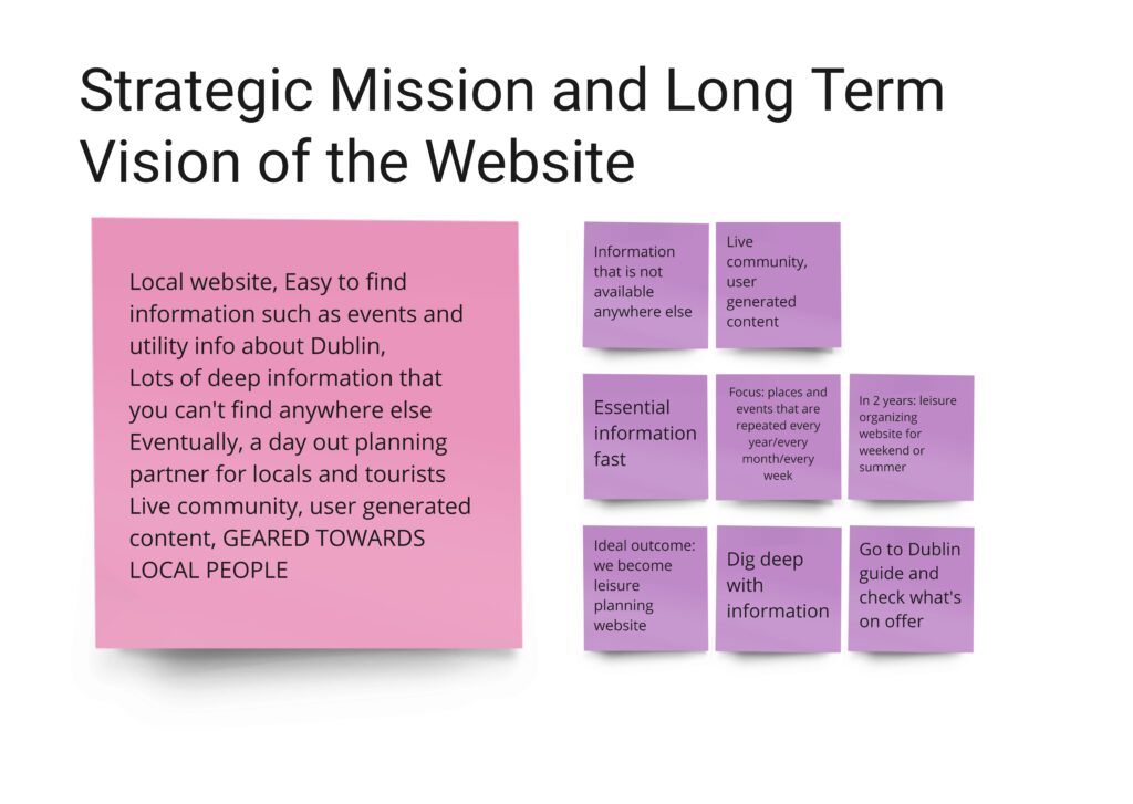
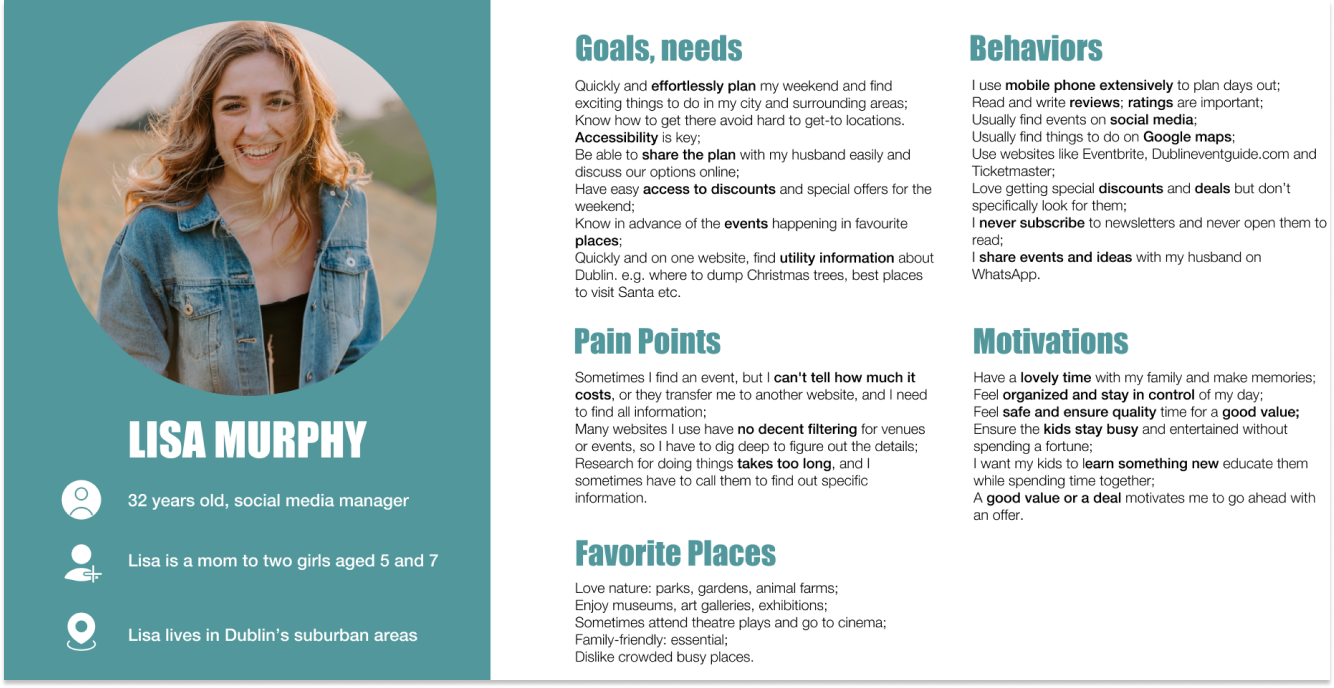
User Persona Insights
When talking with the stakeholder, in addition to strategic questions, I asked if he could define the typical user (what he thinks a regular user is). I also analyzed the Google Analytics data that is available. Finally, I interviewed users about their everyday struggles with finding events in Dublin and their habits in organizing their days out. This research provided a great source of insights into a user profile. Therefore, I placed all user insights in their category on the affinity diagram. This category served as a resource for creating user personas and experience maps.
Empathy Map
Using insights from the User interviews, I created an Empathy map. It helped me empathize with the user, understand their thinking and behaviour and helped immensely create a user persona.
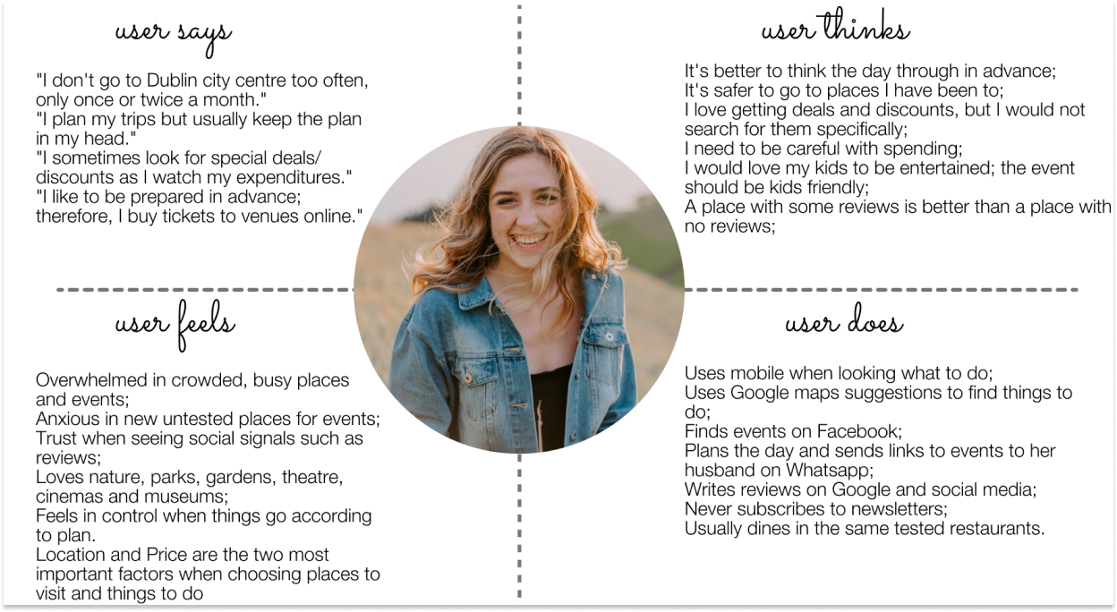
Meet User Persona
User Journey Map
The user journey map helped to uncover some goals, behaviours, mental models and pain points that users experience with the current version of Dublinguide when trying to plan their day out in Dublin next weekend.
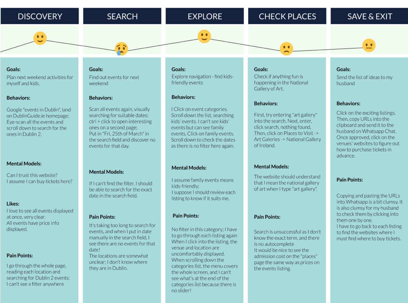
“How Might We” Question
How might we make planning the day out in Dublin quick and intuitive for Lisa so that she feels organized and in control?

DEVELOP(IDEATION)
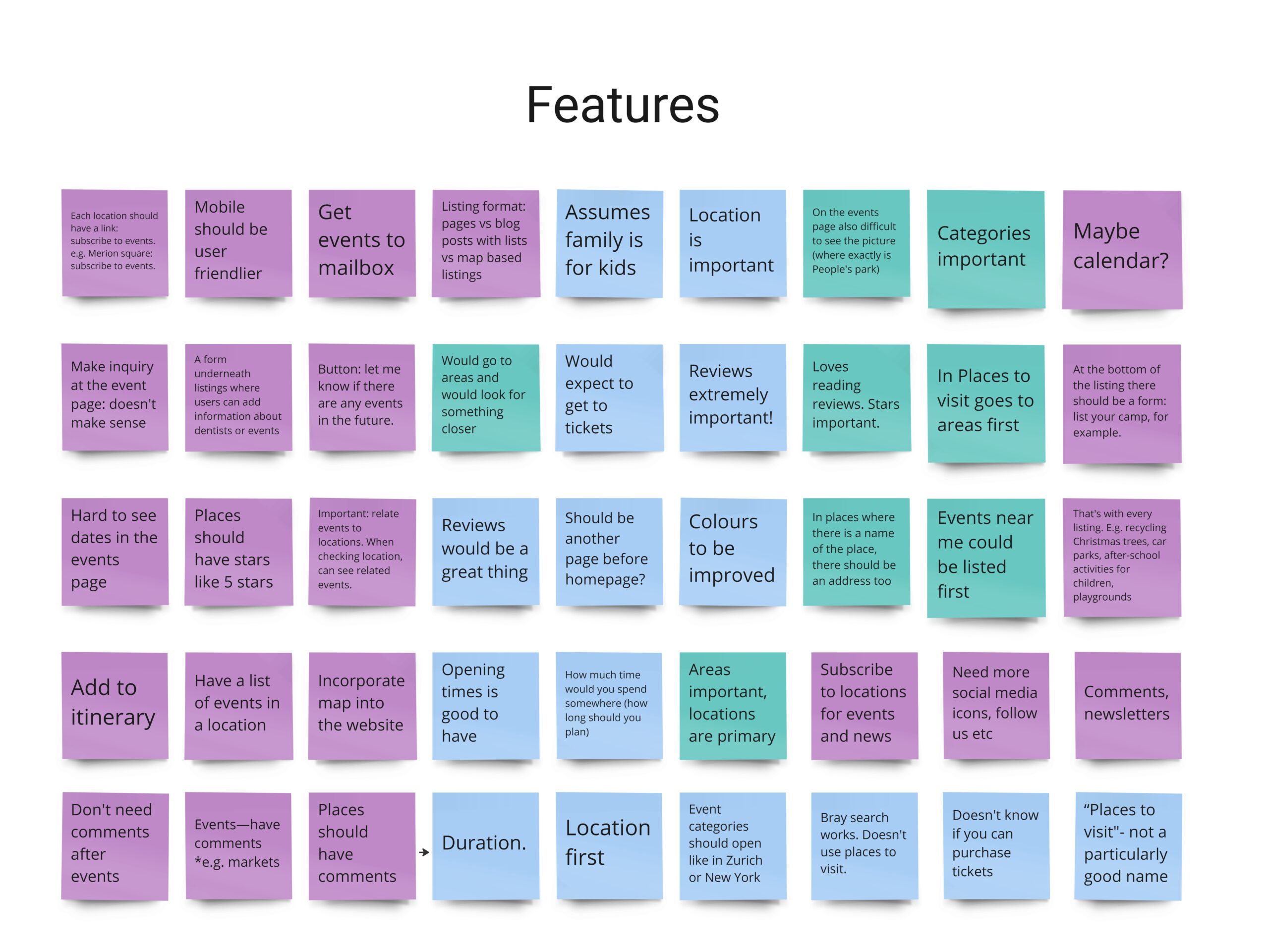
Feature Research and Brainstorming
When conducting user and stakeholder interviews, I asked them to help me brainstorm some additional features that Dublin Guide should have. I also reviewed the competitor websites such as dublin.ie, visitdublin.com, entertainment.ie, eventbrite.ie and others and took notes of other interesting, specific features. The above research resulted in a feature category in the Affinity Diagram.
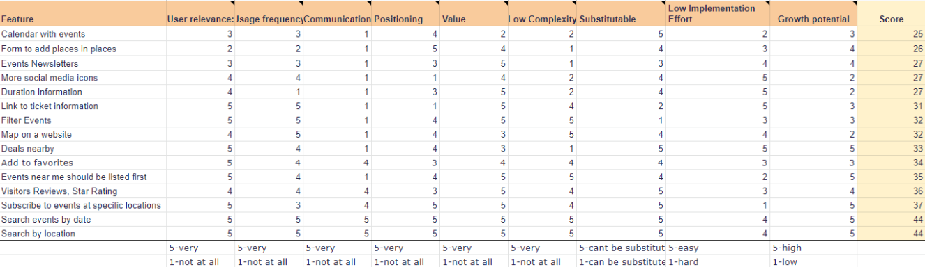
Feature Prioritisation Table
I listed the features in the feature prioritisation table, and with the stakeholder, we gave each of them a rank of 1-5. It helped us decide what features to build first. We ranked features by the following:
User relevance (is it something relevant to many users or just a few), Usage frequency (how often would someone use it), Communication (would it make sense to communicate the feature), Positioning (does the feature strengthen the overall market position), Value (does the feature give superpowers to users), Complexity level (does it reduce the overall complexity of the website), Substitutable (whether it can be substituted), Low implementation Effort (how difficult it is to implement the feature) and Growth potential (Does the feature help us grow).
Inspirational Websites
I started my ideation by building a mood board of “inspirational websites”. I used some that the stakeholder mentioned in his interview. In contrast, I chose the others because I thought they would appeal to the user persona.
Information Architecture Redesign
I started redesigning the Information Architecture by laying out the existing site navigation in Miro boards. In the interview, the stakeholder noted that when uploading new events to the Dublin guide, the categories are created “on the spot” and assigned to wherever it seems at the time. This resulted in very complicated and extensive navigation:
Card Sorting & AI Redesign
I asked the stakeholder and one of the users to participate in the card-sorting process. As a result, we redesigned the information architecture to make much more sense of it. Moreover, based on the user research, we created some categories for future scaling and content strategy (labels in grey).
“To-be” User Flows
In addition, I created two “To-be” (ideal) user flow diagrams: one for finding events in the Dublin Art Gallery and the second for “Add To Favorites.”
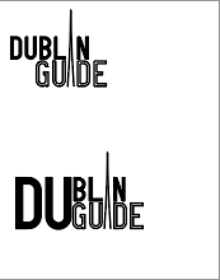
Branding
I continued the Ideation phase with some extra research and sketches for branding. Finally, I came up with an idea to use the famous Dublin Doors as inspiration for the new logotype.
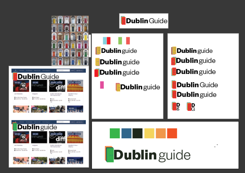
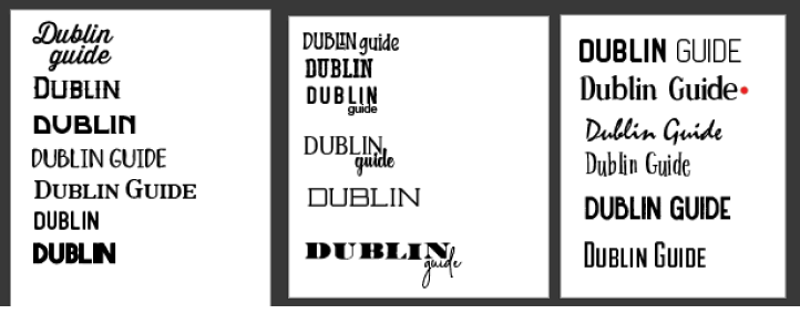
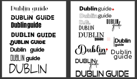
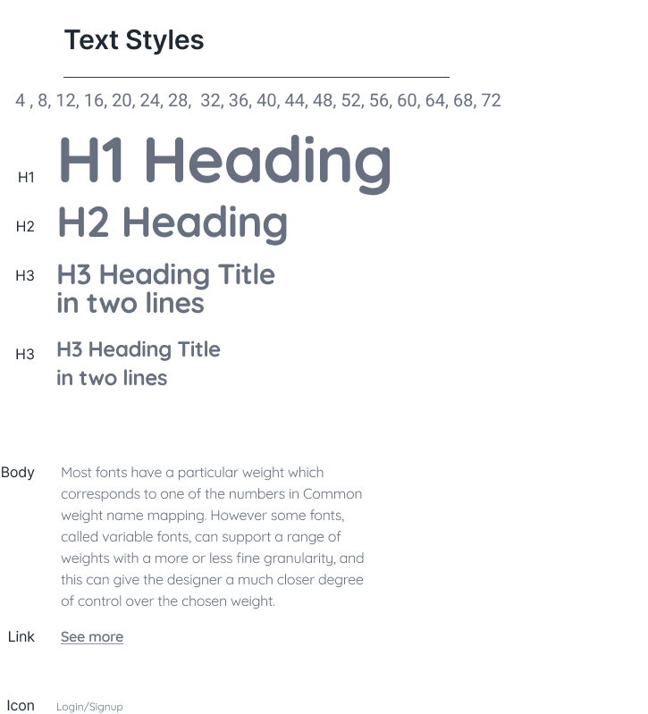
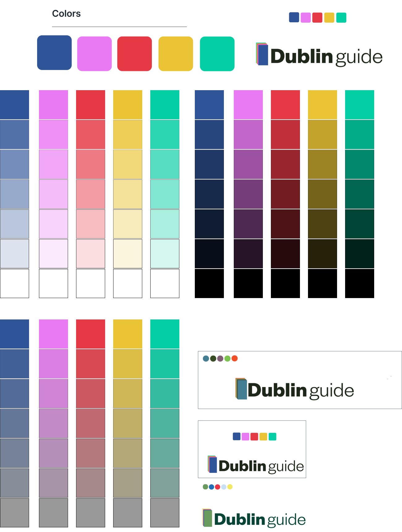
Typography, Grid, Colors
I did some typography trials, tried different grids and colour schemes, and came up with a style guide. After testing 4,8, and 12p grids, I decided to stick with 4p. 12-column grid because I noticed that 8-point and larger grids were insufficient for buttons and labels.
DELIVER (IMPLEMENTATION)
Medium Fidelity Wireframes
I used medium-fidelity wireframes for typography testing. I also wanted to understand the layout Im going with for the mobile app and website before I started playing with high-fidelity colours and photos. I started with some iterations, as I initially wanted a map and the search functionality on the left side of the page and a listing on the right side. However, after seeing this idea, the Interaction Design teacher advised me to change it to a more familiar pattern.
You may want to check the full-sized version on Figma
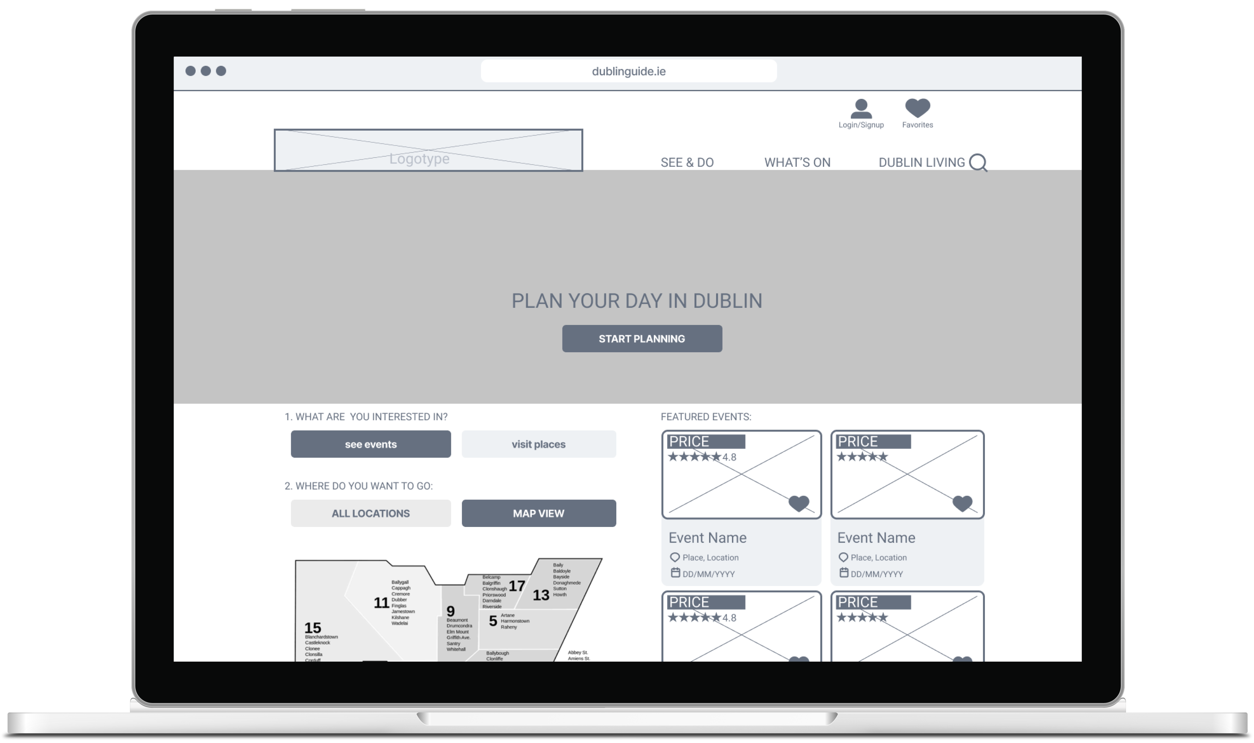
Wireframes with a map (first version)
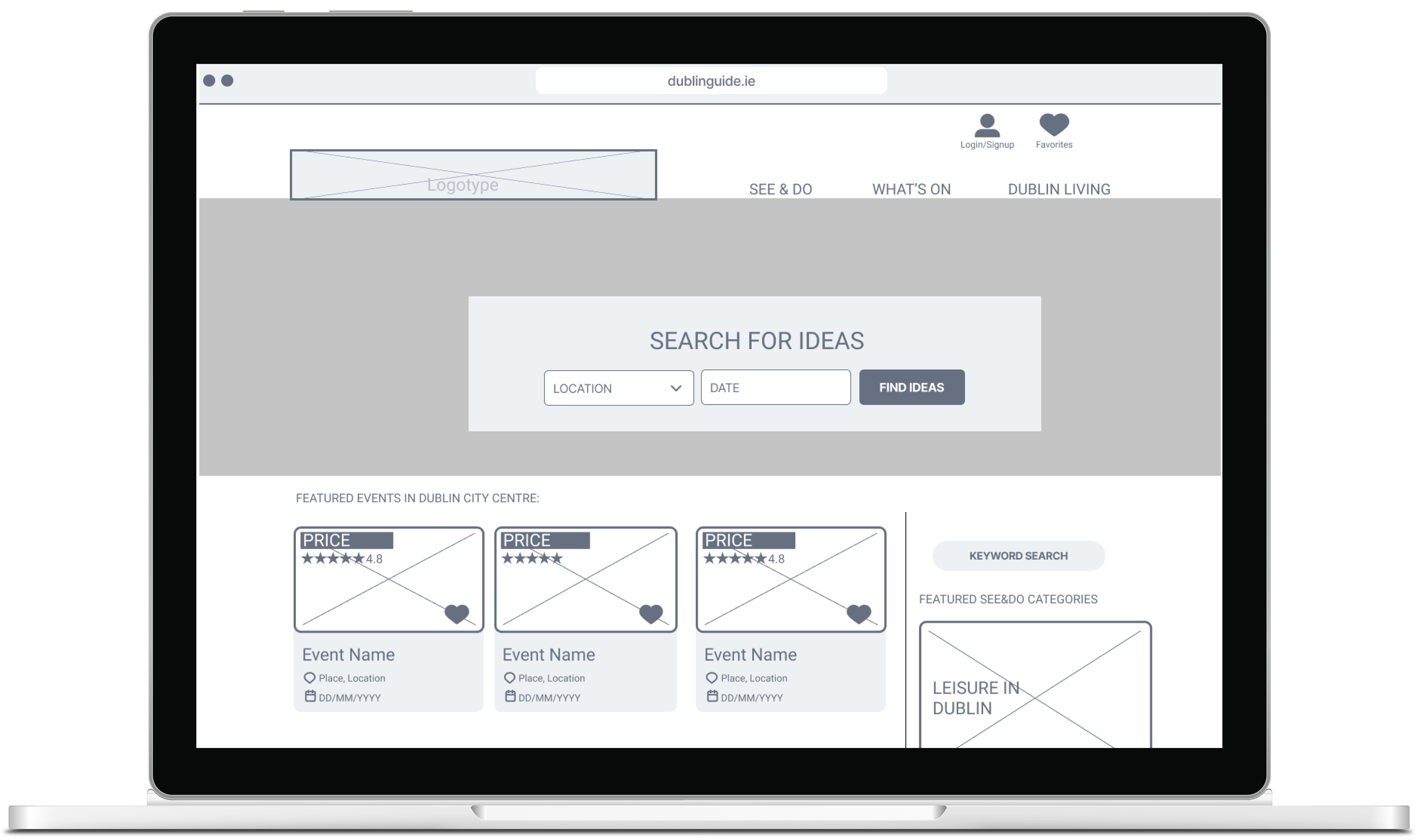
Wireframes with no map (second version)
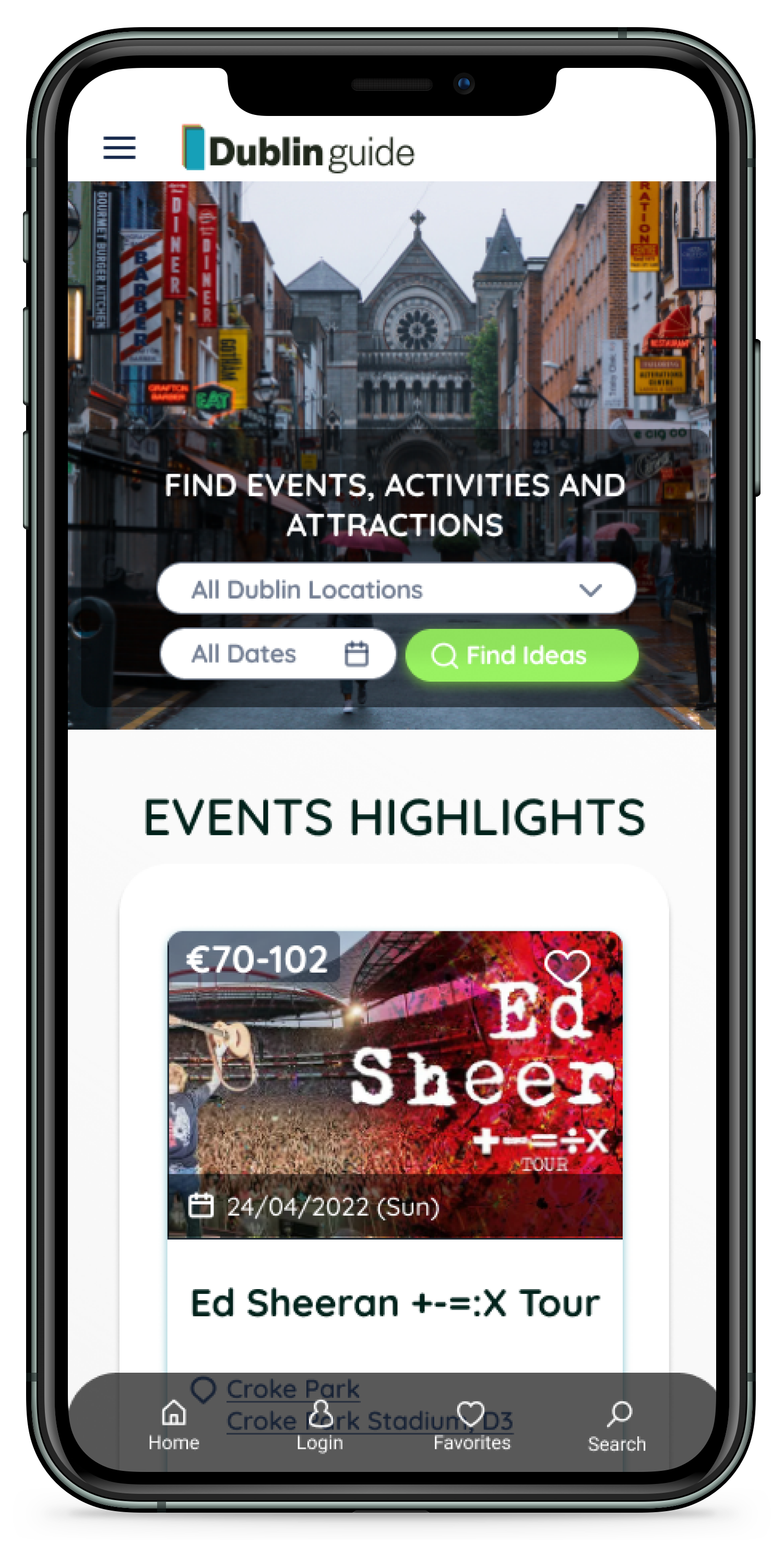
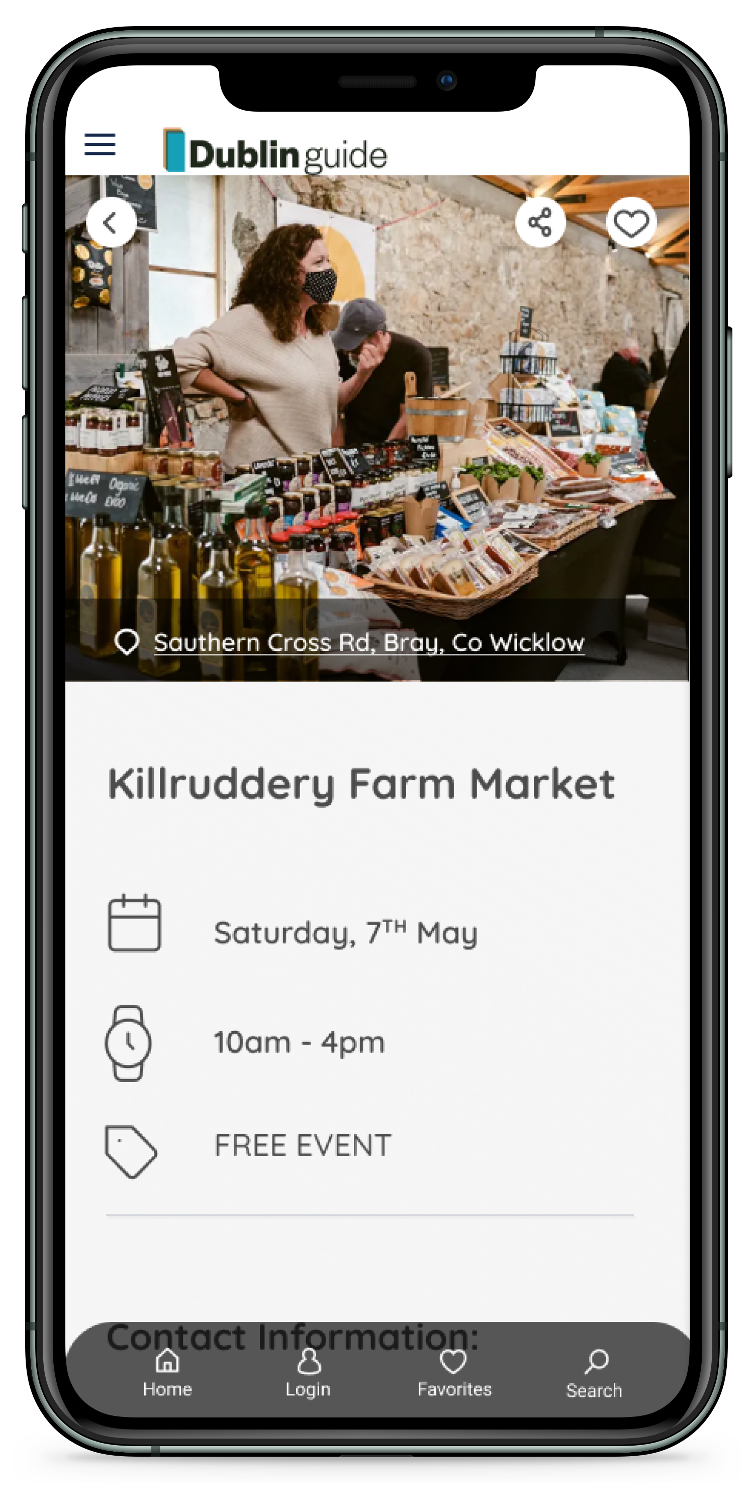
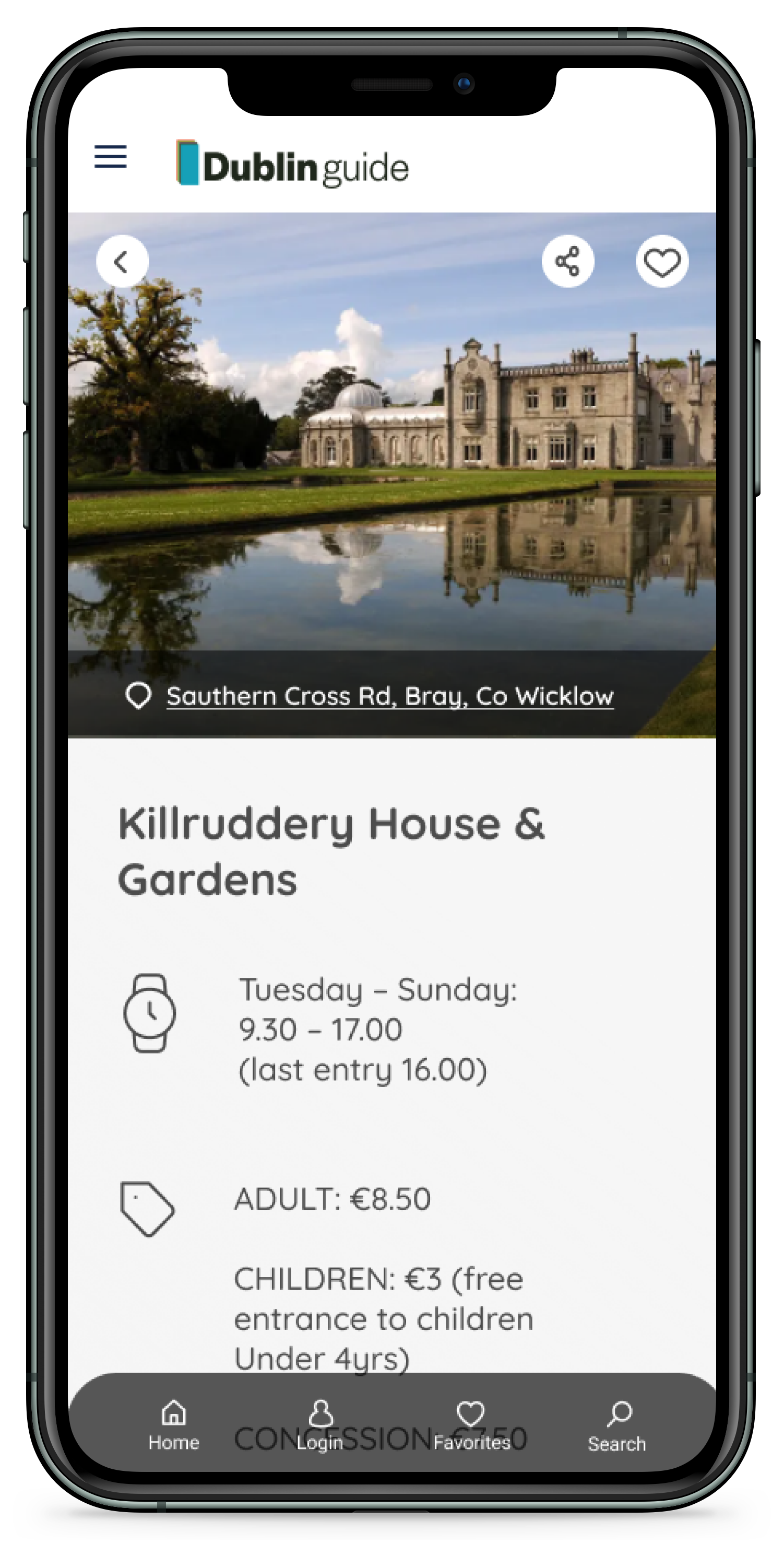
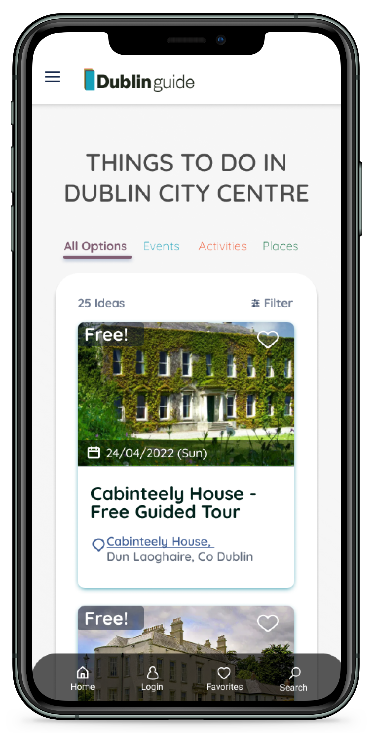
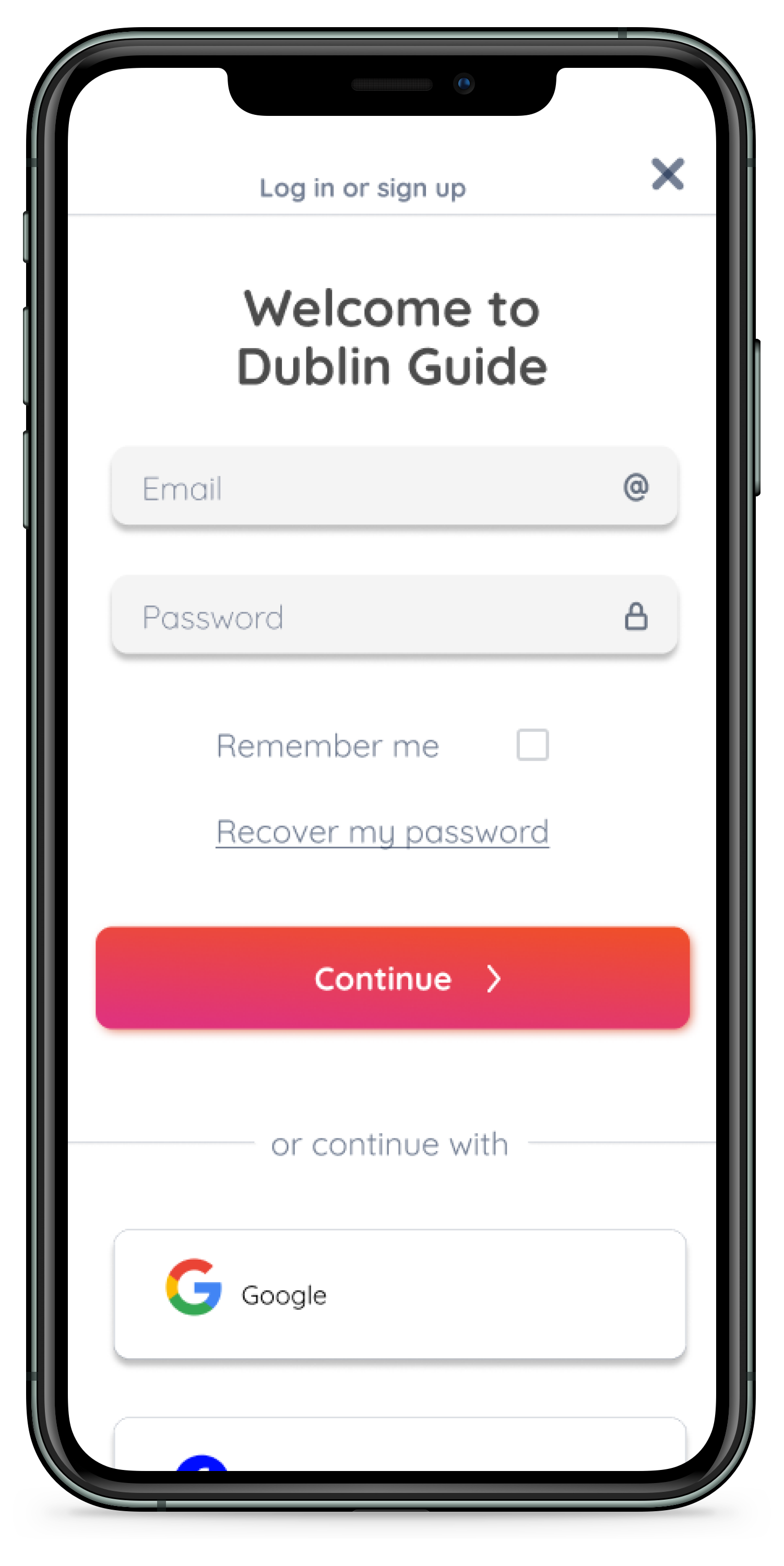
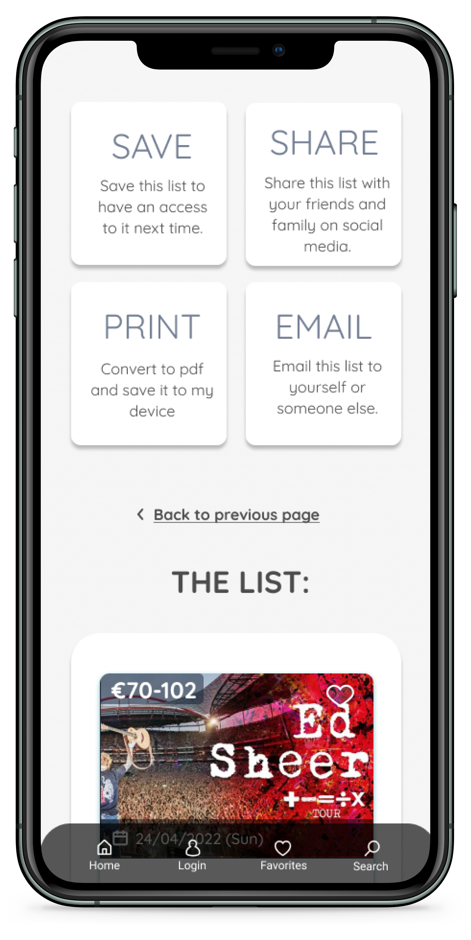
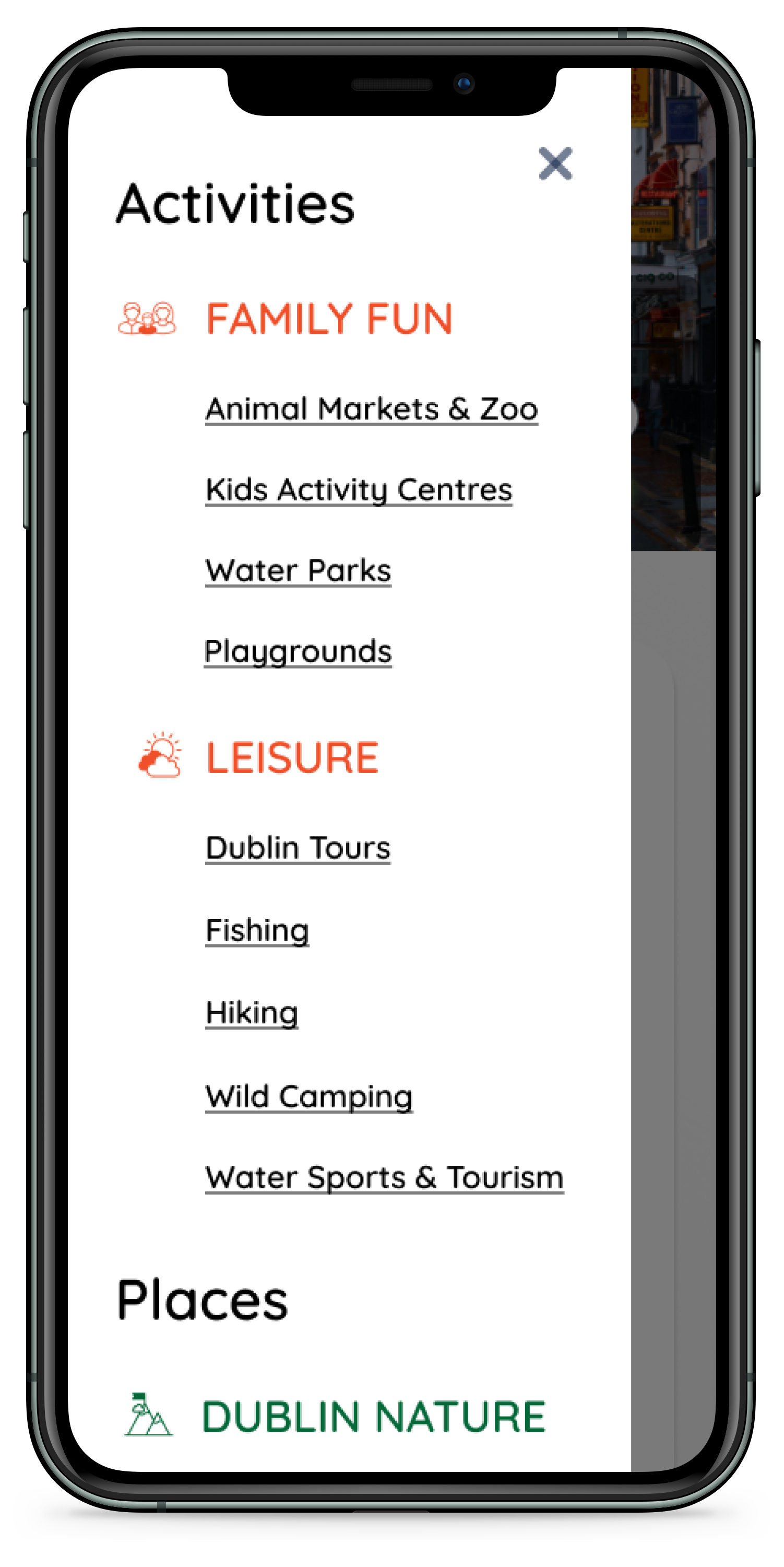
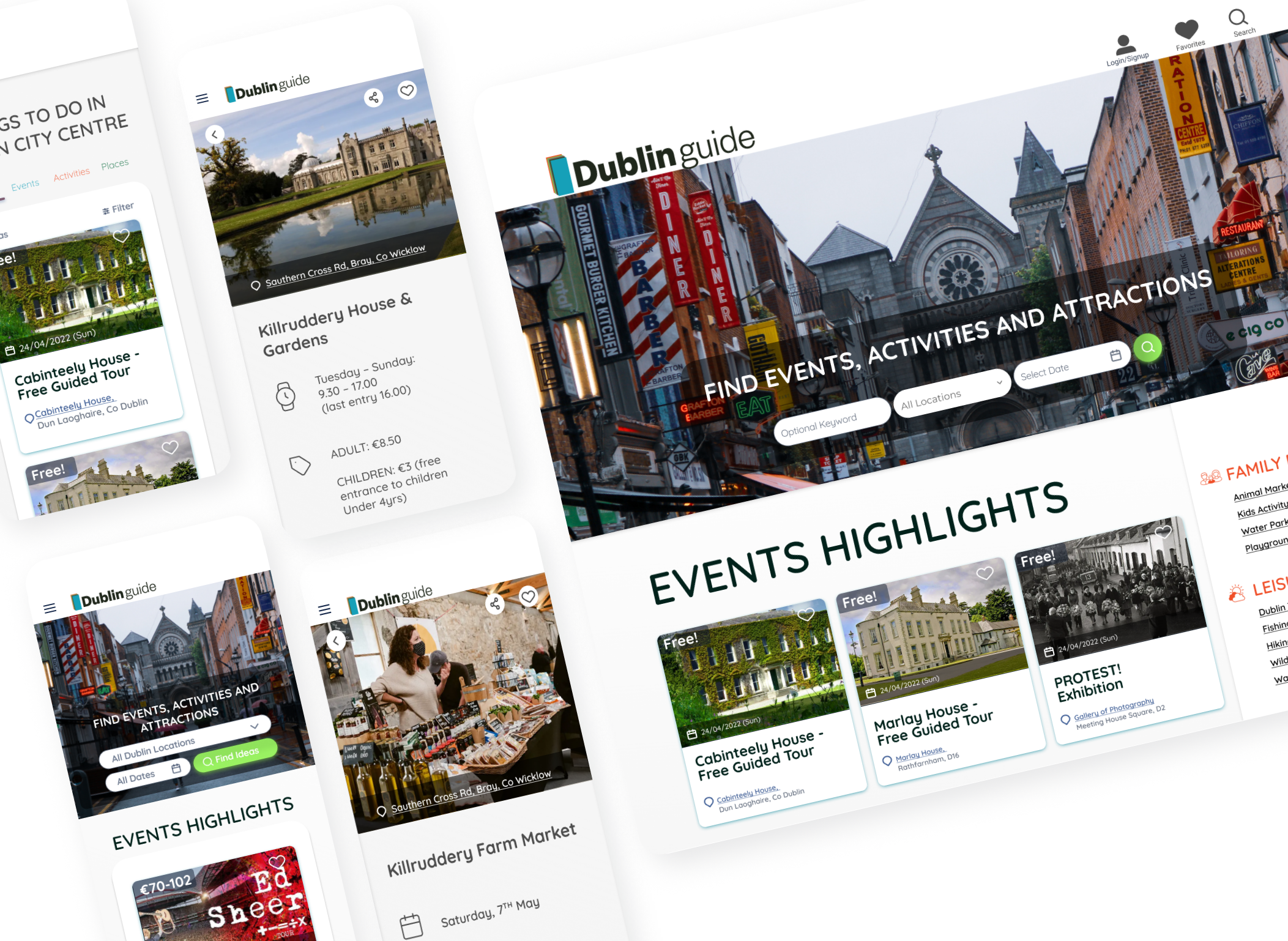
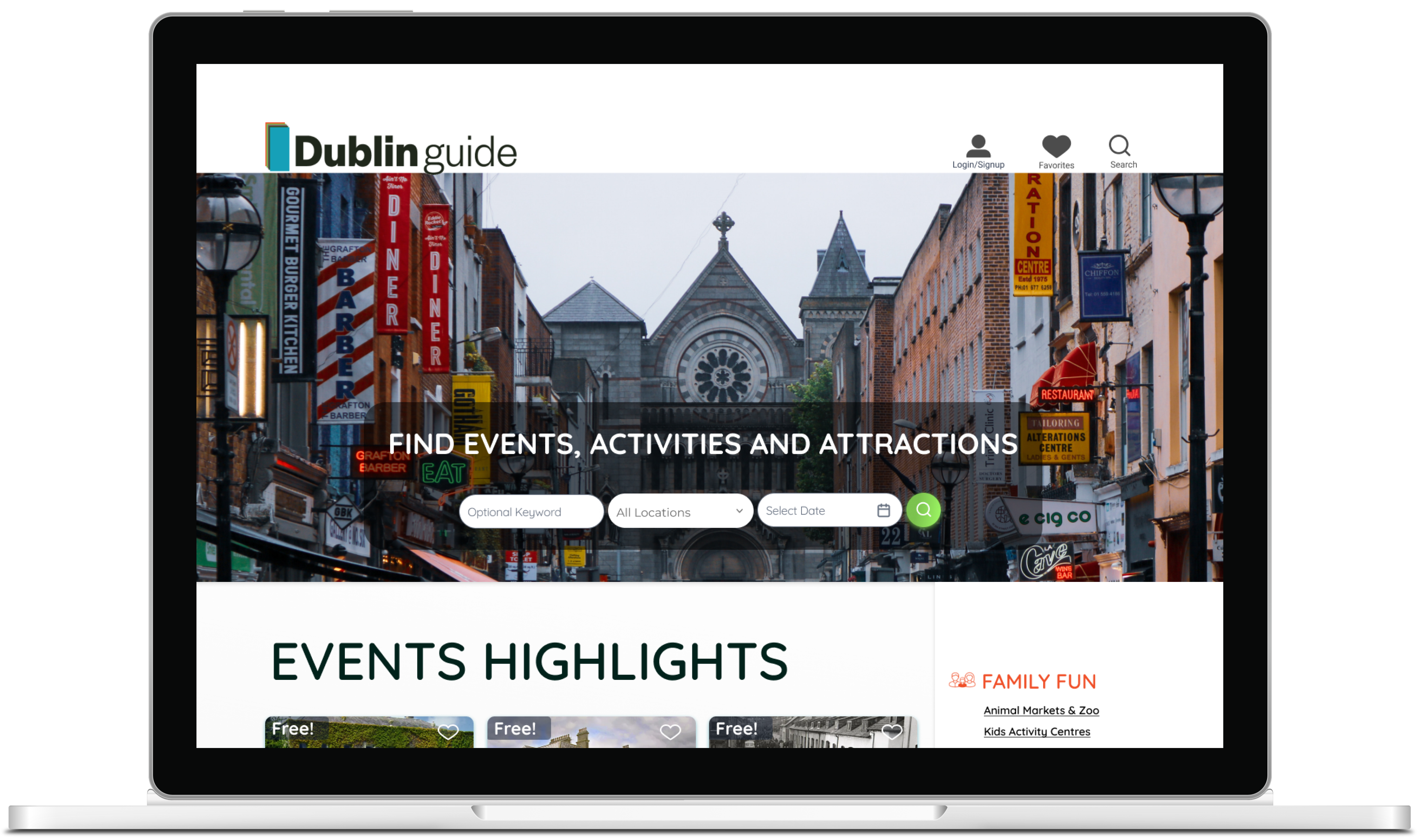
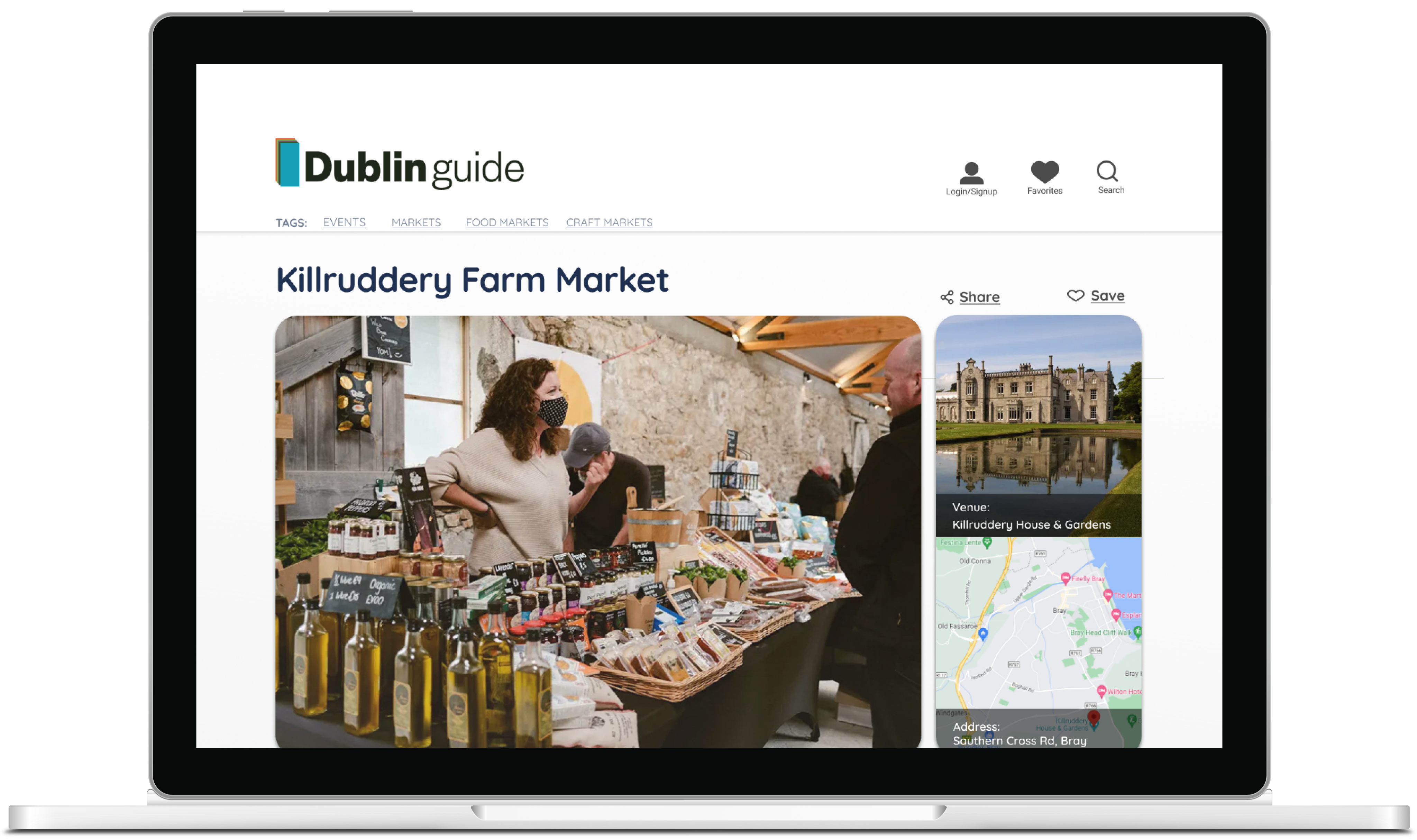
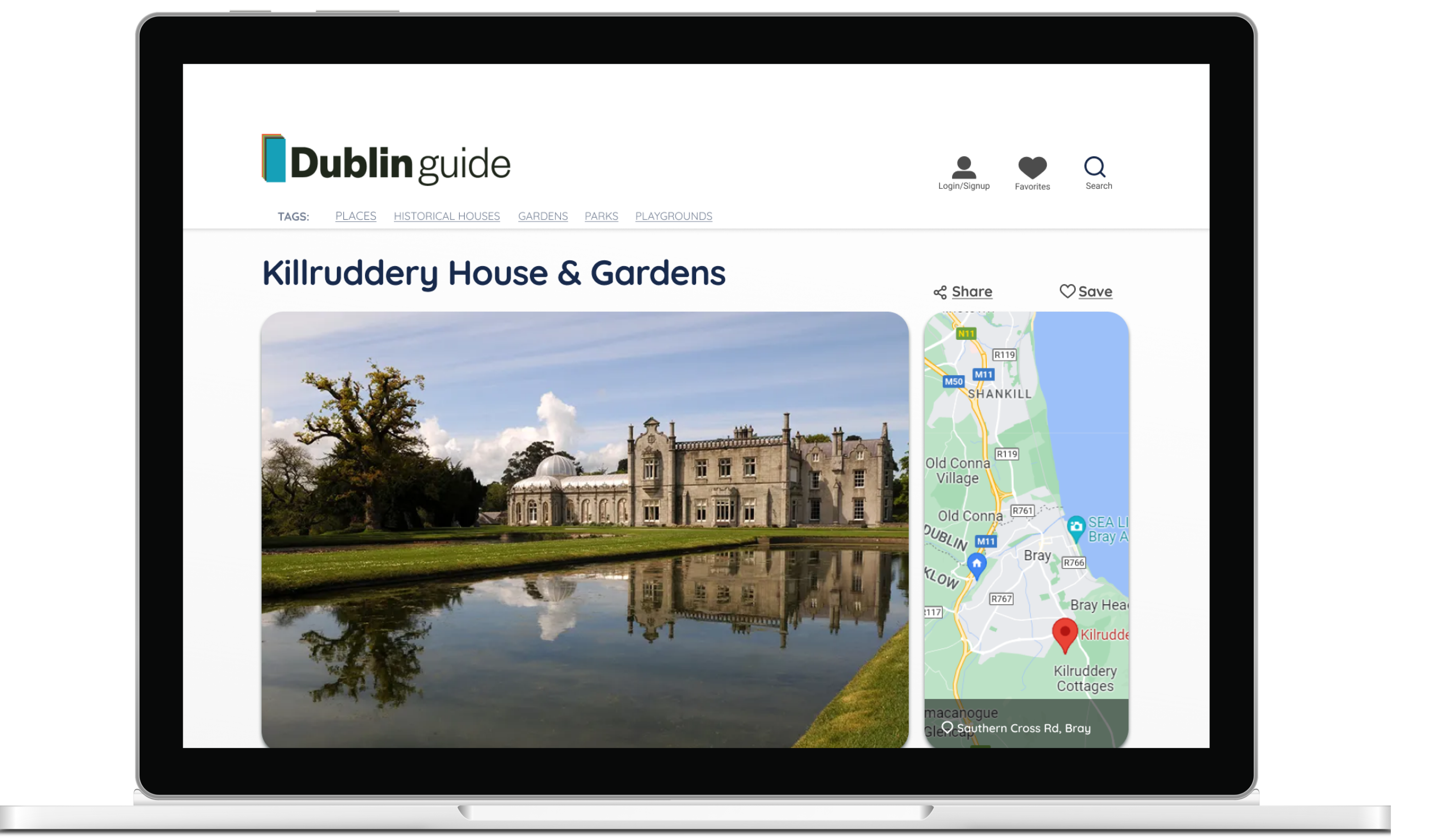
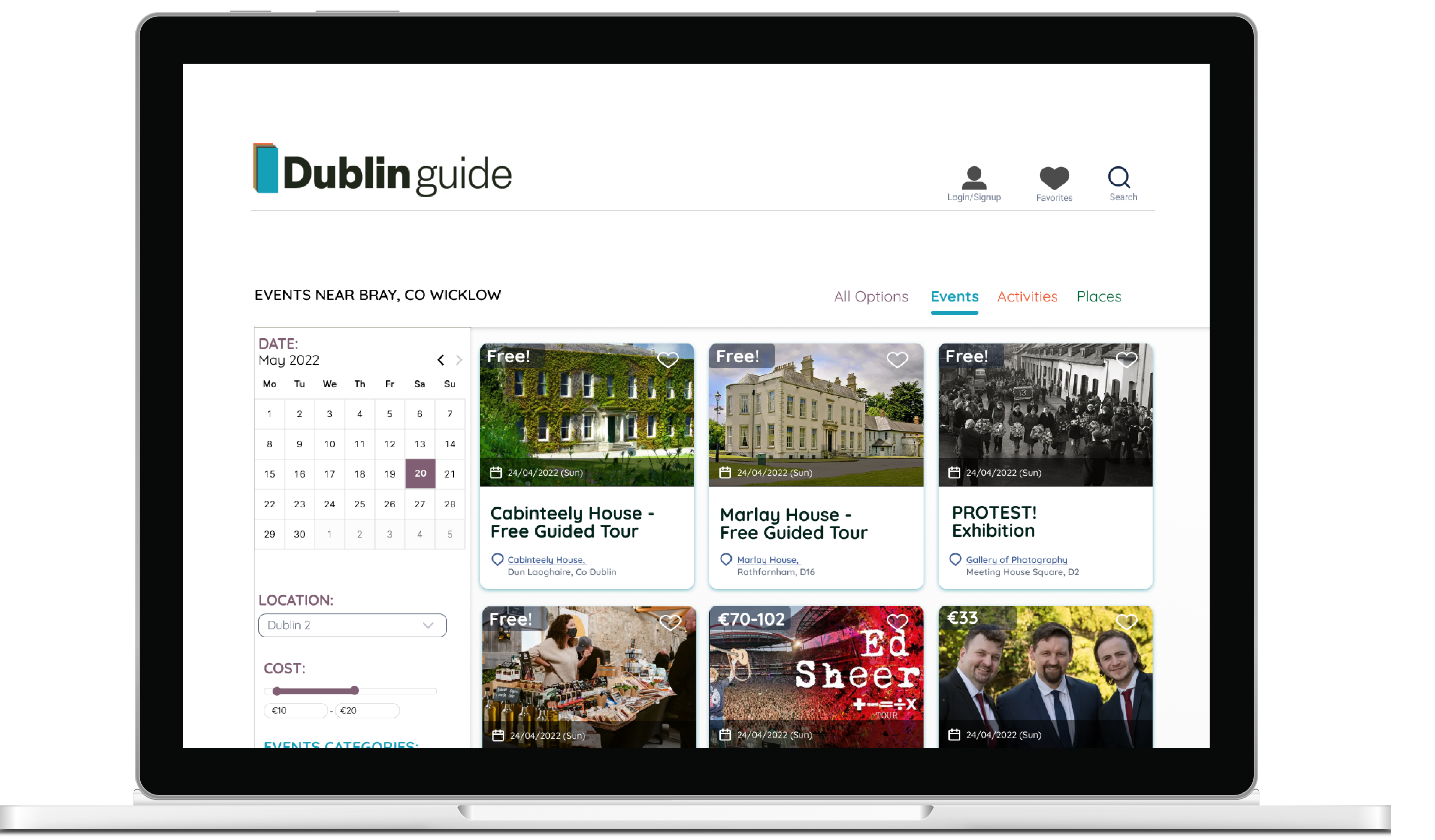
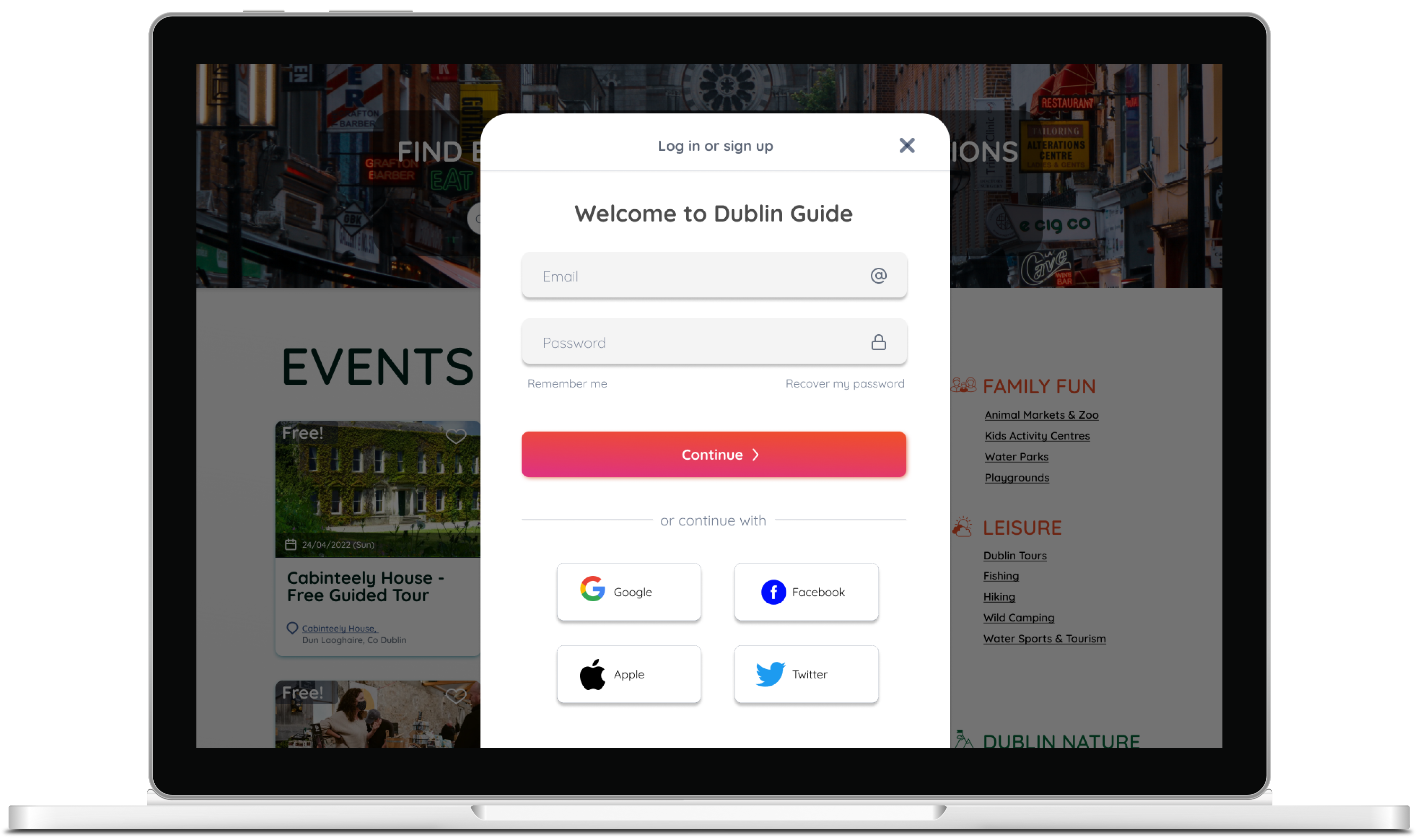
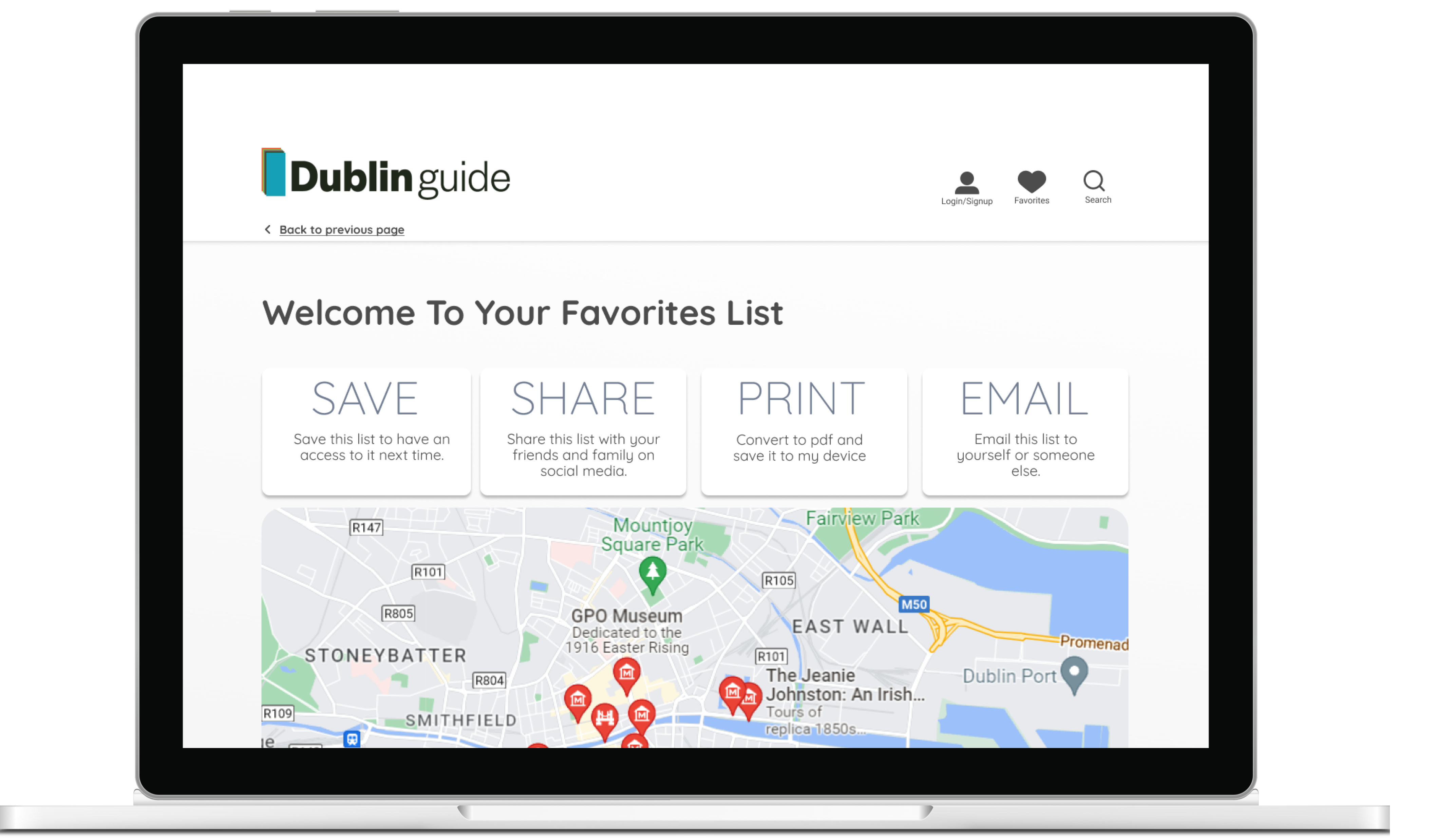
High-Fidelity Prototype: Desktop
High-Fidelity Prototype: Mobile